
Saint Etienne Design Biennial 2006
DNA Eden + "Just before the transformation" This year, as a fringe event of the big exhibition by Matali Crasset, the organizing teams of the Biennial dedicated a whole building to subversion. Respectively set up by Anthony van den Bossche and Ruedi Baur, the "Eden ADN" and "Juste avant la transformation" installations managed to raise if not ethical and philosophical questions at least surprised reactions and exclamations.
"Eden ADN", an exhibition guaranteed with GMOs, invites to think about how man has always used, manipulated and improved nature and how he now does so resorting to Genetically Modified Organisms. Domestic Aibo in a cage, Allerca hypoallergenic cats, Orylag® rabbits whose fur is softer and more expensive than minks’ and the squeal provoking Poekie by Dutch artist Erik Klarenbeek: a stuffed cat containing an electronic mechanism that reproduces artificial respiration -"Kitty, kitty… my God, it’s dead!"-.
Hopefully not a preview of what is awaiting us - cause we love wild, real, authentic stuff, don’t we?- but surely an effective way to restart the debate in a non-caricatured way.

Aibo, Sony's robotic pet
"Juste avant la transformation" also made a strong impression by questioning not the world we are heading to but that we already live in. Ruedi Baur explores the phase preceding the intervention of the designer, "like a stranger who is allowed to ask questions which may be naïve and yet which reveal this assumed everyday life". And a disturbing observation it is. Each of the rooms is dedicated to a particular "state of control": oppression by the forces of law and order, surveillance by public and private entities, and above all mind control by the media, as shown in the "repetitive state" and "state of influence" installations , the former displaying a corpus of hackneyed bank-image pictures of successful executives –on the phone, smiling in their winner-uniforms– and the latter twisting famous ad baselines by associating them with pictures a lot less glamorous than the original illustrations.

Distorted claims taken from advertisements

Repetitive state: standardized, corporate imagery
For Ruedi Baur, the aim of the installation is to expose "a world based upon populist, embellished marketing strategies, the aim of which is to infiltrate into even the tiniest particles of society, to take up all of our time spaces and to format our minds. […] A game of seduction whose sole aim is to increase our consumption still further [and to] crush all forms of cultural singularity until it has forced the soulless language of "globish" upon us all".
A statement which encourages all designers to take a step back and a deep breath before finding new solutions: "We must question and throw doubt upon the established systems, reinvent things on every project, not only the visual side of things but also the conceptual foundations, the structure, the language." A fresh, seditious look at things that might have given faith to some and that might result in new lingoes soon.
www.citedudesign.com
Le labyrinthe Horvat
60 years of photography"Photography is the art of not pushing the button"
340 pictures were displayed at the Landowski cultural centre just outside Paris in a lengthy, elaborate scenography, which led the visitors along the various stages of Horvat’s brilliant career.
The first series of pictures, taken between 1945 to 1956, belong to the documentary genre. Horvat’s reports in Pakistan and India make a strong impression, showing both the lavishness of fabrics and jewels and the reality of the underdog. The pictures taken in Paris in the striptease nightspots of the 1950’s and 60’s are also impressive. The first period conjures up a feeling of factual nostalgia, a feeling that life was hard but you had to survive, that was the way it was: everybody did what had to be done to carry on. This idea of compulsory acceptation of the facts and the notion of fate, translated into black figures on a grey background, make the whole set poignant.
The second phase, for many the greatest one, is fashion photography. Horvat started with a set for Jardins des Modes in 1957, following with Elle, Harper’s Bazaar, Vogue… Horvat later explained the countless constraints fashion editors and artistic directors imposed upon his work -for instance, the model who already wore an ridiculous hat also had to wear lots of make up, lest Revlon should withdraw its advertising campaigns from the magazine-. Still, such limitations made Horvat devise ways to overcome them, letting the idea of control pervade the pictures and giving them a stronger impact. The sophisticated compositions in black and white, the vertical lines convey a disciplined upholding, straightness, even stiffness at times but a oh so welcome sense of distinction.
Horvat often associated models and famous artists in his shooting sessions: movie maker Federico Fellini, writers Antero Piletti or Marie-Louise Bousquet. But the real star is definitely Deborah Dixon, the stern looking, surreal model, always wearing the most extravagant hairdos and outfits –a ruff combined with a mantilla to (not) eat pasta. Horvat said of her that "she was as cold as fish". Probably in life but she looks like a timeless, omniscient, chilling Madonna in all the pictures.

Deborah Dixon with writer Antero Piletti for Harper's Bazaar in 1962
The idea of eternity is also present in a later work called "Very Similar" in the 1980’s, where Horvat blended the beauty of women with the magnitude of History: a series of portraits inspired by painting masterpieces of the past. A way to "see in each of them the ideal beauty of a classical painter or of an era". The result is enthralling: a time travel which leaves you stunned and dreamy about the power of time –same impression as when you look at yourself pictured 10 years ago, only stronger…

Very Similar series: Isolda, 1980
The last part of the exhibition is dedicated to Horvat’s –attempts at– digital imaging in the early 1990’s and to his daily photographic journal. "Walks around Boulogne-Billancourt" is probably one of the most depressing series. A wealthy, quiet suburb where nothing happens, the shop windows displaying their garish "special offers" and "sale" in empty streets. Ugly, vulgar settings conveying boredom and dullness. A noticeable change within the exhibition, which started with harsh scenes in poor areas and ends with dreary ones in rich areas. As if the violence of yesterday had been superseded by numbing weariness: a cruelty you can neither name nor spot, yet very present in Horvat’s work. A last word on my favourite picture of the show: Provence, 1959. A newborn lamb is photographed by its totally humanized, sitting mother: life means blood, sufferings and miracles.

Lamb birth in Provence, South of France, 1959
Mois de la Photo in Paris
Every 2 years, November is the "Mois de la Photographie" in Paris. Exhibitions everywhere, from little secret galleries to the most famous ones, tens of artists from all over the world are represented, giving you the opportunity to train your eye and tastes. I only managed to see three of them, this year.
"Jeanloup Sieff. Les années Bazaar, New York, 1961-1966", a series of thirty fashion pictures for the magazine of the 50s, 60’s. Even to a philistine like me, the use of lines and lights actually mean something. Of course, the universe that is created here partly owes to the supernatural models and to the era. But the overall atmosphere, mischievous, solemn and ironic at the same time, the atypical postures, the reinterpretations and references, everything is genuine talent. It’s a world you feel lucky to see displayed on walls, even though you secretly would rather live in it. My two favourites: 1/a woman casually sitting on her Honda, looking at the objective, with over-made up eyes, earnest gaze and natural authority and 2/another woman making a phone call in a public booth, in a swaying, care-free pose, while you imagine, from the look of the pedestrians on the street, that chaos is closing in.

Fashion picture with China Machado, Jimmy Moore, Hiro and children, New York city, 1964
I also went to "Bird’s Eye View", a selection of pictures by Gauthier Gallet, French press photographer who used to work for prestigious magazines like Elle, Vogue UK, Numéro, L'Officiel, Mixte, Jalouse, Self Service, ID... The press release of the exhibition is right to point at the artist’s playful way to look at models, fashion directors, make up artists and all the people backstage. Although the relevance is not immediate –the pictures distinctly bear the "fashion shooting" mark–, Gauthier Gallet manages to "over-glamorise" a microcosm already well known by showing its tribal rites, such as the spectacular make ups, and by suggesting its tacit rules in a light-hearted way.

A well-deserved break, Gauthier Gallet
And the winner is… Granny! The exhibition by Nina Korhonen, winner of the Swedish "Picture Book Prize" in 2004 for her "Anna, Amerikan Mummu", which recounts the life of her exile grand-mother in NY. Anna at the supermarket, Anna sipping coffee in her kitchen, Anna’s well-kept sewing-box. I did not like the pictures meant to praise the model’s "lust for life" because I find it too easy to show a naked 80 year old woman only to stress a so-called committed discourse such as "everyone has a right to be –and to exhibit themselves, perhaps– whatever their age and physical shape, etc". But on the whole, I really appreciated the poetic and ironic tones of the pictures. Nina Korhonen knows exactly how to capture her model’s gaze, by turns cheerful, impish or simply childlike when she is walking across the waves. I especially liked a picture of Anna standing by an outside crèche in a décor that must be a Malibu suburb house showered by a nauseating sunset and all decorated with Christmas strings of lights. Anna is standing by the crèche and about to slip unnoticed beside Joseph and Mary…
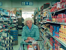
The Granny series by Nina Korhonen


